Wednesday, July 28, 2010
Header of My Blog
Delineation & Drafting
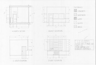 Delineation drafting is definitely one of the most challenging and difficult projects I have ever encountered. It is a long time project that consume a lot of time and hard work. During this project, measuring is always hard to be accurate and measuring everything in one time without missing any details is impossible. Tracing before hand really helps and easy to correct while mistakes were made. In the transforming process from trace to vellum I realized it is necessary to pay attention to the
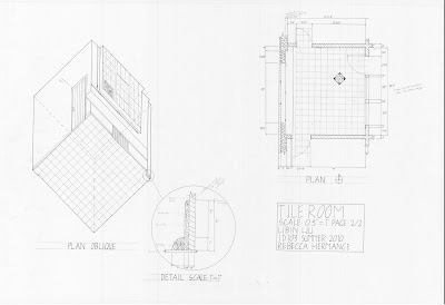 line weight and choosing the right size of markers. Eventually, I feel great success and satisfaction while I finished than any project I have ever done.
Quilt Block
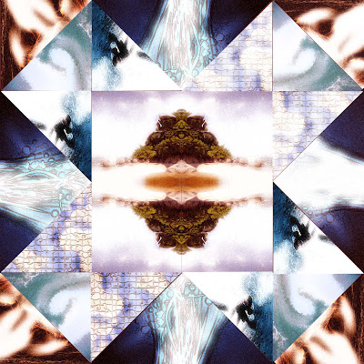 In this project of making quilt block, I was amazed by how much Photoshop can do to create variety and the feeling of extreme unusualness. I retrieved all my images from the beach and ocean to edit. You can easily feel the passion of wave and the peace but powerful sense underneath the water. After every single images to be edited by Photoshop, they became more illusional than realistic. Eventually I put them into a pattern and see for magic of mixture. During the process of this project, carving picture and putting them linear to a nice and neat edges are time consuming and requires for patient and dedication.
Color & Pattern
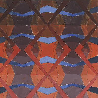 Painting is a very challenging but important part of design. With the varied usages of different color in different tint and shade to fill up the line pattern, this project expressed the emotion of transformation and the contrast with the horizontal direction of blue stripe. Mixing colors and try to get the right one is definitely the most challenging part of this project. Matching the color wheel really helps me a lot during the process. Also I was having hard time to keep the edges of the stripes to be neat as well as painting the color evenly without having some areas are too light, some are too dark.
Trace Figures
 Drawing human figures are part of the most important elements to show the proportion between spaces. And tracing figures helps me to understand the proportion of a human body as well which is important on drawing human figures. Not too much details could also emphasis the importance of proportion than how does the human look like.
Colored Cross-section Fruits
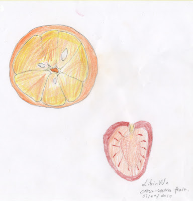 Color is not one of my strengths. With careful object analysis and observation I used colored pencils to sketch the cross-section of an orange and a tomato. The most challenging part of using colored pencils are impossible to mix color like gouache paints. With this limitation, it is hard to get the right color I want. However color pencils are alway convenience and save time that works just fine for sketching.
Room Interior
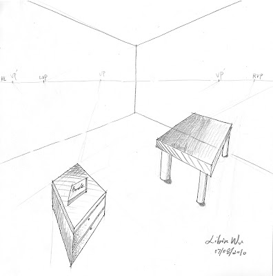 It is a simple room interior with the walls and a few furniture appeared. With various of vanishing points, I achieved the goal to draw proportional furniture in facing different angles, as well as the book. Combining the usage of crosshatching I added several shades. However, I still need to work on managing shades on proper place. Some of the shades on this sketch is not logical.
Crosshatching
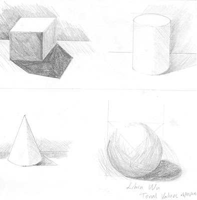 This time I crosshatching on different geometry shapes which are cube, cylinder, cone and sphere. It really helps me to analysis the distribution of shades at different areas since most of the graphic elements are the combination of geometry shapes. For example, we draw a cube before drawing a desk, we combine different human body with cones, cubes and etc. It is a good way to practice using crosshatching technique for sketching shading.
Wednesday, July 21, 2010
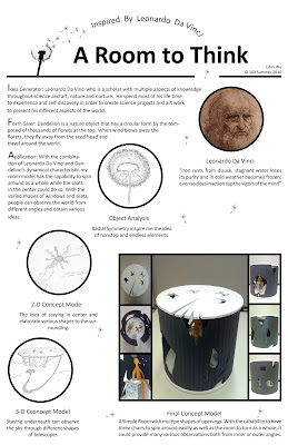
Room Model Poster
Tuesday, July 13, 2010
Textile Design


In the traditional Chinese culture, dragon plays an important role in people’s life. This tremendous mythical creature represents power, fortune and happiness which still have believed in the Chinese minds nowadays. Red is a fortunate and lucky color as people in China have been using a lot in special occasions like wedding and the Chinese New Year. With the shape of dragon logo in the form of a red stamp shape; it shows the impression stability of dragon in the Chinese’s mindset. Brush Calligraphy had been the most common way for people in China to write or paint in aesthetic manner. With the traditional writing in Chinese of dragon to be placed on the shape of dragon; it indicates there is not only a shape but a meaning inside as well as in people’s hearts. The creativity of having two heads with hair in one brush fulfills the idea of connection throughout the page. Eventually placing in a repetition pattern on a white background emphasized every single unites which achieves the goal of less is more.
Saturday, July 10, 2010
Fruit Sketch

Negative Space

Line Project

Friday, July 2, 2010
Two Points Perspective


